
In a market where dozens of SaaS tools solve the same problem, your website is often the deciding factor. Visitors judge your product within seconds. This guide covers what actually works in 2026—clear layouts, purposeful motion, and trust signals that convert visitors into paying customers. It also serves as a source of SaaS web design inspiration for SaaS founders and product teams looking to improve their websites.
Key Takeaways
- 2026 saas web design is defined by clean layouts, bold typography, and motion used to clarify product stories rather than add visual noise.
- High-converting saas landing pages incorporate key elements such as a clear value proposition, security trust signals, and interactive demos—these components work together to move visitors from curiosity to free trials in under 30 seconds.
- AI-driven personalization, dark mode variants, and privacy-by-design patterns are now baseline expectations for any serious saas company.
- For security-focused platforms like Atomic Edge, design must spotlight WAF capabilities, OWASP Top 10 coverage, and real-time protection without overwhelming non-technical users.
- The best saas website design in 2026 is a continuous experiment: A/B testing, session replay analysis, and iterative optimization replace once-a-decade redesigns.
Why SaaS Web Design Trends Matter in 2026
Design is the first feature prospects experience. In a crowded market, your site must instantly communicate what you do and whether it matters to the visitor—within 3–5 seconds. Miss that window, and they bounce to a competitor.
Exceptional digital experiences are crucial for SaaS brands, as they elevate credibility, boost conversion rates, and help your website stand out in a competitive landscape.
Buyers now compare every B2B tool against consumer-grade polish from brands like Stripe, Notion, and Monday. A $2M ARR startup faces the same scrutiny as an enterprise vendor. Sub-2-second load times, optimized Core Web Vitals, and mobile optimization are table stakes. With 40%+ of saas traffic coming from mobile devices, sites that prioritize desktop-only experiences lose a significant share of potential customers.
For cybersecurity platforms like Atomic Edge, trustworthy design directly impacts whether visitors feel safe routing traffic through your edge network. If the site appears outdated or cluttered with technical jargon, prospects question whether the platform is well-maintained. Calm, structured design paired with transparent performance metrics builds immediate confidence.
Core Principles of Modern SaaS Web Design
Four principles underpin effective saas website design in 2026: clarity, credibility, speed, and conversion focus.
Clarity of value proposition means your above-the-fold hero answers two questions instantly: “What does this do?” and “Is it for me?” Effective hero copy uses 8–12 words maximum. For example: “Block WordPress attacks before they reach your site.” A supporting subhead (12–18 words) adds specificity or addresses objections.
Conversion-focused structure limits top-level navigation to 5–7 items: Product, Solutions, Pricing, Customers, Docs, Contact. Everything else lives one click deeper. A prominent cta guides visitors toward a single primary action. Effective layouts and visuals guide users toward the primary call to action, improving conversion rates.
Credibility and trust signals belong near conversion points:
- Customer logos from recognizable brands
- Security certifications (SOC 2, ISO 27001, GDPR)
- Quantified metrics (“Blocks 10 billion+ requests daily”)
- Customer testimonials with specific outcomes
Performance and accessibility are non-negotiable. Target LCP under 2.5s, FID under 100ms, CLS under 0.1. Use semantic HTML, WCAG 2.1 AA compliance, and proper heading hierarchies.
For Atomic Edge, this means surfacing OWASP protection copy, latency numbers (2ms average overhead), and 99.99% SLA commitments directly in the design.
Design Trends Defining SaaS Websites in 2026
Several visual and UX themes define leading saas websites this year.
Clean, whitespace-rich layouts reduce cognitive load. Generous margins, 2–3 sentence text blocks, and visual breaks chunk information for scanning. This approach works especially well for security and analytics products where the underlying concepts are complex. Incorporating stunning visuals alongside clean layouts builds trust and credibility, helping users quickly assess the professionalism of the service.
Bold typography and tight copy dominate high-performing sites. Large headings (48–72px on desktop), short supporting lines, and limited jargon create visual hierarchy. Clean typography paired with 1.6–1.8x line spacing improves comprehension across audiences. Visual focus, achieved through strategic placement of imagery and design elements, helps direct visitors’ attention to the main call-to-action (CTA) and increases engagement.
Dark mode and soft gradients signal sophistication for developer, security, and infrastructure tools. Dark palettes reduce eye strain during extended viewing and are now a baseline expectation for technical buyers. Subtle two-color gradients add depth without distraction.
Micro interactions and subtle animation serve functional purposes: guiding attention, providing feedback, or explaining processes. For a WAF, animating traffic flowing through protection layers clarifies the concept faster than a paragraph. Animations should complete in 300–500ms and respect prefers-reduced-motion.
Modular, card-based layouts scale with product growth. Cards for key features, pricing tiers, integration partners, and customer quotes create organized, scannable pages that accommodate content changes without redesigns. Including product visuals within these cards quickly conveys value and supports user understanding by showcasing the interface or service in action.
For cybersecurity saas, avoid fear-based visuals. Calm, structured design conveys control. Confident neutrals with strategic accent colors (teal, bright green) position security as solved infrastructure, not an ongoing crisis.
AI-Driven Personalization and Adaptive SaaS Experiences
By 2026, personalization extends beyond greeting users by name. Sites now tailor layouts, CTAs, and entire sections based on behavioral and firmographic data. Companies implementing robust personalization see 20–40% conversion lifts.
Role-based messaging shows different value propositions to different buyers:
- Founders see: “Protect your WordPress site in minutes—no coding required”
- Security engineers see: “OWASP Top 10 protection with 99.99% uptime SLA”
Geo-aware and industry-aware experiences adapt compliance badges and case studies. EU visitors see GDPR badges prominently; WordPress hosting visitors see WordPress-specific testimonials.
Behavioral personalization adjusts content based on previous visits. If someone spent time on security features but bounced from pricing, they might see expanded technical documentation on return.
Privacy and transparency are critical. Sites must clearly communicate data collection practices, provide preference controls, and maintain explicit cookie disclosure. For security-focused saas like Atomic Edge, opaque tracking undermines the core trust proposition.
Security, Trust, and Compliance as Design Elements
For infrastructure and cybersecurity saas, visual design must explicitly communicate safety and reliability.
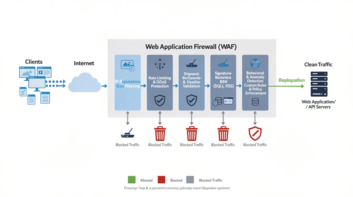
Security storytelling transforms abstract concepts into visual sequences. A pipeline diagram showing user traffic → Atomic Edge inspection → blocked threats → clean traffic to origin explains WAF protection faster than technical documentation. Animated sequences showing “SQL Injection Attempt → Pattern Detected → Request Blocked” make protection tangible.
Trust signal placement positions credibility near conversion points:
Element | Placement |
|---|---|
Uptime statistics (99.99% SLA) | Near pricing/signup forms |
Security certifications | Hero or first two sections |
Customer logos | Early and repeated throughout |
Customer quotes | Adjacent to CTAs |
Designing for non-technical buyers requires layered information. Lead with plain-language benefits (“Blocks bots and SQL injection attacks”), then offer expandable technical detail for security engineers. Use simple icons and progressive disclosure rather than dense paragraphs. Visual and interactive elements help highlight key information, making crucial details stand out and enhancing user engagement.
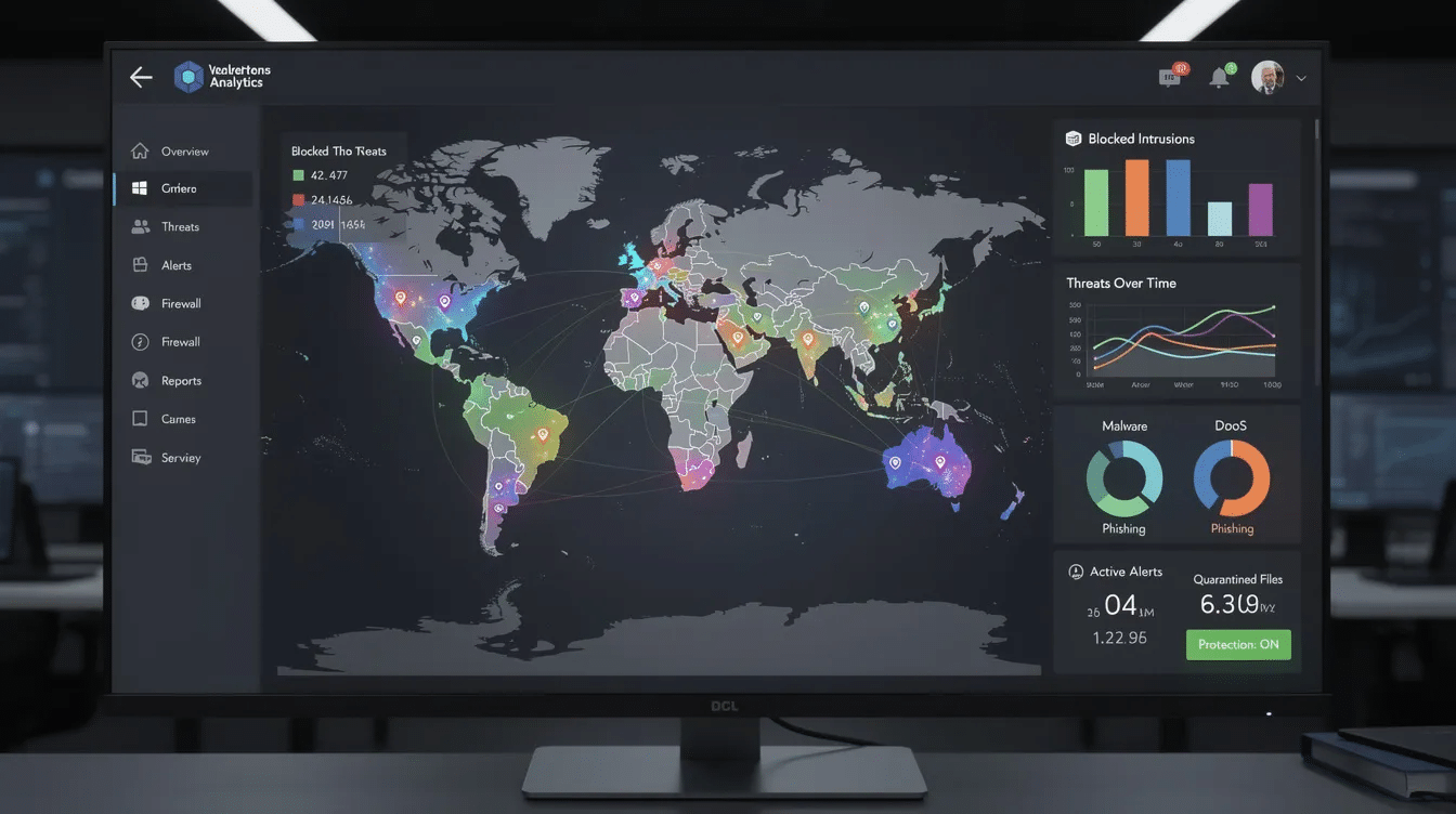
For Atomic Edge, this means visualizing protection through clean dashboards, real-time threat charts with geographic heat maps, intuitive IP reputation lists, and simple toggles for enabling rulesets.
Customer Quotes and Social Proof as Trust Accelerators
Customer quotes and social proof are among the most powerful tools in modern SaaS website design, acting as instant trust accelerators for potential customers. In a landscape where buyers are inundated with choices, seeing real-world endorsements from recognizable brands or peers can be the deciding factor that moves a visitor from curiosity to conversion.
Effective SaaS companies strategically showcase customer testimonials, project management success stories, and customer logos throughout their site. These elements do more than decorate a landing page—they address objections, validate the solution’s value, and demonstrate measurable results. For example, a SaaS website might feature a carousel of customer quotes directly beneath the hero section, each highlighting how the platform improved team communication or streamlined workflows. This approach not only builds credibility but also helps potential customers envision their own success with the product.
Social proof is especially critical for SaaS companies introducing new or complex solutions. By surfacing customer testimonials and case studies, you reassure visitors that others have already achieved value, reducing perceived risk. Whether it’s a quote from a CTO praising robust CMS security or a small business owner sharing how the platform simplified payment processing, these authentic voices help convert visitors into paying customers.
Incorporating social proof into your SaaS website design isn’t just about aesthetics—it’s about creating a persuasive narrative that guides visitors, addresses their concerns, and demonstrates the real-world impact of your solution.
Addressing Objections and Risk Reversal Through Design
Addressing objections and offering risk reversal are essential strategies in SaaS website design to convert hesitant visitors into paying customers. Potential customers often arrive with questions or doubts—about security, ease of use, or whether the solution fits their needs. The best SaaS companies proactively address these concerns through thoughtful design and messaging.
One of the most effective ways to reduce perceived risk is by offering a free trial or a clear money-back guarantee. Prominently displaying these offers near calls-to-action (CTAs) reassures visitors that they can try the product with minimal commitment. For example, a SaaS website might feature a “Start Free Trial—No Credit Card Required” button, immediately below a list of customer logos and trust badges. This combination of risk reversal and social proof helps guide visitors through the sales funnel and increases conversions.
Clear, concise messaging is also crucial. Use straightforward language to explain how your solution addresses common pain points, and place FAQ sections or objection-handling copy near pricing or sign-up forms. Visual trust signals—such as security certifications, customer testimonials, and recognizable brand logos—further establish credibility and help address objections before they become barriers.
By integrating these elements into your SaaS website design, you not only build trust with potential customers but also create a seamless path to conversion. The result is a site that guides visitors, increases conversions, and drives sales for your SaaS company.
Conversion-Focused UX Patterns Across the Funnel
Modern saas sites design different patterns for each funnel stage.
Awareness-stage layouts prioritize education:
- Problem-focused headlines
- Brief explainers with high impact visuals
- Soft CTAs: “See how it works” or “View security checklist”
- Optional gated resources to capture email
Consideration-stage patterns help prospects evaluate:
- Feature comparison blocks with clear visuals
- Interactive product tours or embedded demos
- Use-case pages for specific audiences (WordPress agencies, e-commerce stores)
- Strong visuals showing the product in action
Decision-stage designs remove friction:
- Transparent pricing grids with side-by-side plan comparisons
- FAQ section addressing migration, lock-in, and implementation
- Clear call to action buttons: “Start Free Plan” or “Talk to Security Engineer”
- Strategic use of multiple CTAs guides users toward various actions—such as viewing features, exploring pricing tiers, or creating custom plans—enhancing engagement and increasing conversion opportunities.
Reducing friction matters at every stage. Minimal sign ups fields (email + password only), SSO options, no-credit-card-required trials, and risk reversal copy all improve conversion rates. Each additional form field reduces completion by roughly 3–5%.
Visual Storytelling for Complex SaaS Products
The best saas landing pages tell before-and-after stories rather than listing features.
Scenario-driven visuals show common pain points and solutions:
- Scene: “Your WordPress site under bot attack” with animated visuals showing malicious traffic
- Resolution: “Atomic Edge blocks attacks in real-time” with traffic being filtered
- Outcome: “Your site stays fast, visitors see zero disruption”
Interactive product tours let prospects explore without signing up. Auto-playing (muted) videos, guided walkthroughs, or embedded HTML5 demos showing specific features build confidence. Keep tours short (30–90 seconds) and focused.
Data-backed storytelling uses specific metrics as visual elements:
- “99.99% uptime SLA” displayed prominently
- “Average setup time: 5 minutes”
- Product screenshot showing blocked threats counter
Illustrations and diagrams simplify complex concepts. A diagram showing traffic flow through an edge network conveys architecture more effectively than paragraphs. Custom illustrations aligned with brand identity feel more premium than generic stock imagery.
Leading SaaS websites can also serve as valuable design inspiration for teams seeking to elevate their own digital presence, offering examples of effective visual storytelling and user engagement.
Mobile-First and Multi-Device SaaS Experiences
With 40%+ of saas discovery happening on mobile, responsive design is mandatory.
Hero sections on mobile must maintain the core message without cramped text. Stack headline above image in a single column. Keep primary CTAs large (minimum 44×44px) and easily tappable.
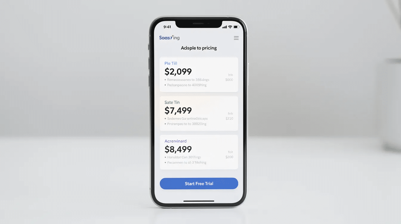
Pricing tables on mobile require thoughtful adaptation:
- Stack plans vertically with the most popular visually emphasized
- Use expandable accordions for feature lists
- Keep “Get Started” buttons visible without excessive scrolling
Touch-friendly interactions need larger tap targets with sufficient spacing (8px minimum between elements). Toggle switches for security modules, tabs for monthly/yearly pricing, and dropdowns should be oversized relative to desktop.
Performance on mobile networks requires aggressive optimization:
- WebP images sized for device resolution
- SVG icons instead of raster graphics
- Lazy-loading for video content and live threat maps
- System fonts or lightweight web fonts (2–3 weights)
For tools like Atomic Edge, critical dashboards—attack feed, IP block lists, quick-enable toggles—must be genuinely usable on mobile for on-call engineers reviewing blocks at 2am.
Design Systems, Branding, and Consistency for Scaling SaaS
Fast-growing teams need reusable design systems to avoid inconsistent interfaces as products expand. Robust design systems also benefit engineering teams by ensuring consistency and scalability as products and features evolve.
Core components of a modern design system:
- Typography scale (12px → 48px in consistent progression)
- Color tokens (primary, semantic, neutral)
- Spacing scale (4px, 8px, 16px, 24px increments)
- Button components with states (default, hover, active, disabled)
- Form field components with consistent styling
- Data visualization standards
Brand colors, illustration style, and tone of voice should be documented so new pages—product launch announcements, security updates, landing page variants—align instantly.
Extend systems to marketing assets: landing pages, microsites, and gated resource hubs inherit core typography, color, and spacing rules while allowing layout flexibility.
For Atomic Edge, consistent visualization of threats, rules, and analytics across sales site, dashboards, and documentation ensures users build a coherent mental model from evaluation through daily use.
Common Mistakes to Avoid in SaaS Web Design
Even the best SaaS companies can fall into common web design traps that undermine their ability to convert potential customers. One of the most frequent mistakes is unclear or confusing messaging—if visitors can’t instantly grasp your value proposition, they’re likely to bounce. Every SaaS website should prioritize clarity, ensuring that headlines, subheads, and supporting copy communicate value in seconds.
Another pitfall is poor mobile optimization. With a significant share of SaaS traffic coming from mobile devices, a site that isn’t responsive or user friendly will lose potential customers. Make sure your design adapts seamlessly across devices, with touch-friendly interactions and fast load times.
Social proof is often underutilized or misplaced. Failing to feature customer testimonials, logos, or case studies can make your solution seem unproven. Conversely, overloading pages with too many CTAs can confuse visitors and dilute your message—focus on a clear visual hierarchy and a single, prominent call to action per page.
Visuals matter, too. Relying on static screenshots or generic animations that don’t add value can make your site feel dated or uninspiring. Instead, use high impact visuals—such as interactive product tours, animated diagrams, or real customer quotes—to demonstrate your solution’s capabilities and reinforce your value proposition.
By avoiding these common mistakes and embracing best practices in SaaS web design, you can create a site that is user friendly, builds trust with potential customers, and drives conversions for your SaaS company.
Measuring and Optimizing SaaS Web Design Performance
Every design decision requires validation against actual behavior.
Core metrics to track:
- Conversion rate to trial/demo
- Time-to-first-action
- Bounce rate on key pages
- Funnel drop-off points
A/B testing should run continuously:
- Hero headlines (monthly tests)
- CTA copy variations
- Layout changes on pricing page
- Presence/placement of trust signals
Session replay and heatmaps reveal friction points. These tools often show that elements teams believe are prominent are never seen due to poor scroll positioning. Optimizing visual content and layout based on these insights can increase conversions by persuading visitors to take action.
User segmentation by role, plan, or use case identifies whether specific personas struggle at certain steps. If enterprise visitors bounce from pricing 30% more than small businesses, the pricing page needs attention.
Design for saas in 2026 is an ongoing experiment. Quarterly review cycles, not annual redesigns, keep conversion rates improving.
How Atomic Edge Applies 2026 SaaS Web Design Trends to Security
Atomic Edge synthesizes these trends into a site that makes WAF protection feel approachable and visibly effective.
Above-the-fold hero uses clear copy: “Protect your WordPress and modern CMS sites from OWASP Top 10 threats in minutes—no server changes required.” A calm gradient background (deep blue to teal) avoids fear-based imagery. The primary call to action cta reads “Start Free Protection.”
Visualizing protection includes:
- Live attack counters showing threats blocked today
- Geographic threat maps displaying attack origins
- Pipeline diagrams: User → Atomic Edge → Origin Server
Trust woven into design through:
- Uptime statistics (99.99% SLA)
- Customer logos from WordPress agencies and hosting providers
- Testimonials with specific outcomes (“Zero successful attacks in 6 months”)
- Effective customer communication is supported by targeted messaging and clear engagement channels, making it easy for users to get help or updates when needed.
Pricing displayed visually with clear tier differentiation:
Plan | Target | Key Features |
|---|---|---|
Free | Small sites | Core OWASP protections |
Advanced | Growing sites | Custom rules, analytics, priority support |
Enterprise | Mission-critical apps | Multi-site management, SLA, dedicated support |
These patterns make security feel approachable and fast to set up, converting visitors who might otherwise be intimidated by technical complexity into sign ups and eventually paying customers.
FAQ
How often should we refresh our SaaS website design in 2026?
Full visual overhauls typically happen every 18–36 months. Key pages (hero, pricing, feature tours) should iterate quarterly based on performance data. Run smaller A/B tests monthly on headlines, CTAs, and layout tweaks so design evolves continuously. Major product shifts—new modules, pricing changes—naturally trigger more substantial updates.
Do early-stage SaaS startups need advanced personalization from day one?
Early-stage teams should first nail a clear, universal value proposition and fast, simple pages. Start with light segmentation—separate pages for developers vs. non-technical buyers—rather than dynamic layouts powered by heavy AI stacks. As traffic scales past a few thousand monthly visitors, personalization experiments become meaningful and should be phased in.
What’s the best way to show security features without overwhelming visitors?
Use a layered approach: lead with 3–5 plain-language benefits (“Blocks bots and SQL injection attacks”) and let users click for technical detail. Diagrams, short animations, or annotated static screenshots explain concepts better than dense paragraphs. Group deeper documentation in dedicated pages for security engineers and auditors.
Which tools are popular in 2026 for building high-performing SaaS marketing sites?
Modern saas teams frequently use Webflow, Framer, or Next.js-based JAMstack setups for visual flexibility and performance. Integrating analytics (GA4, privacy-friendly alternatives, product analytics) and A/B testing platforms is as important as the page builder itself. For security-focused saas, careful configuration of third-party scripts keeps pages fast and reduces attack surface.
How can a security-focused SaaS like Atomic Edge stand out visually from competitors?
Lean into calm, confident design instead of fear-driven imagery. Use structured layouts, user friendly dashboards, and human-centered case studies. Distinctive yet accessible color palettes, consistent data visualization for threats and traffic, and storytelling focused on customer outcomes create differentiation. Combining trustworthy visuals with transparent performance metrics (blocked threats per day, latency impact) sets you apart from typical lock-and-shield iconography.