Hello!
We are excited to announce that we have created a brand new website for ourselves! Sometimes its difficult to focus on ourselves when we are so often focused on our clients. With new and exciting projects on the horizon, we thought we would take the opportunity to chip away and eventually launch a new website for ourselves.
While previous site was on the Drupal CMS, we decided it would be nice to migrate back to our old friend, WordPress.
Though our site may seem kind of simple, there’s a few interesting things that we did that we wanted to share.
Mobile Detection with jQuery
Why does anyone ever need to detect for mobile devices anymore? Don’t we just use media queries? Well, yes that is the best practice answer.
But throw in multiple layers of caching like Memcache, Page caching, Object caching and Varnish caching and you will soon realize that simple mechanisms like having an HTML5 full screen video on your page may cause complications on Mobile and Tablet devices.
One of the things we thought was interesting was using jQuery to show/hide certain elements that are better geared for mobile or desktop browsing. The reason for us was having a full width/full screen experience on desktop with an HTML5 video but restricting it to a more minimal (and smaller) static image when browsing on the phone.
With jQuery you can make a simple if-condition based on a media query, using the matchMedia() function :
There are many ways to accomplish mobile detection logic, but this is the simplest method and could be applied to many different scenarios. The root of this problem lied within the multiple layers of caching that were implemented. Certain CSS files were being loaded under certain conditions and unfortunately the caching system would cache a mobile CSS file and serve it to desktop users.
With jQuery, everything is executed in the browser every time the page is loaded, regardless of caching. This makes for a more reliable method of controlling the content exactly as you see fit.
Sticky Sliding Menu
We created a plugin a while ago called Shift8 Full Nav. Simply put, this plugin creates a sticky header menu the scrolls down when you click. This option worked for us and is mobile friendly, so we used it!
One of the things that wasn’t included in the plugin (yet – we plan on adding it soon!) was having a nice, slick and smooth transition of color when you click to expand the menu.

This can be done relatively easily with jQuery using an onClick trigger to fade / out some color. We thought it would be interesting if we could implement this sort of animation purely in CSS! We used the keyframes rule.
So when you click the menu trigger, jQuery adds and removes the respective “menu-is-open” and “menu-is-closed” CSS classes. I’ll share the open CSS keyframes to show how the animation of fading the color works :
/* Animation for opening menu to fade grey */

@-webkit-keyframes fadeIt {
  0%   { background-color: #ed2647; }
  50%  { background-color: #840b1f; }
  100% { background-color: #191919; }
}
@-moz-keyframes fadeIt {
  0%   { background-color: #ed2647; }
  50%  { background-color: #840b1f; }
  100% { background-color: #191919; }
}
@-o-keyframes fadeIt {
  0%   { background-color: #ed2647; }
  50%  { background-color: #840b1f; }
  100% { background-color: #191919; }
}
@keyframes fadeIt {
  0%   { background-color: #ed2647; }
  50%  { background-color: #840b1f; }
  100% { background-color: #191919; }
}
.nav-header.menu-is-open {
    /* add a background color to the header when the navigation is open */
    background-color: rgba(25, 25, 25, 0.96);
    -webkit-animation: fadeIt .3s ease-in-out;.
       -moz-animation: fadeIt .3s ease-in-out;.
         -o-animation: fadeIt .3s ease-in-out;.
            animation: fadeIt .3s ease-in-out;.
}
Pretty straightforward, right? You just have to define a 0% , 50% and 100% HEX color code for the “Fade” transition to be smooth. We wanted the transition to be quick, so we specified a 0.3 second time for it to happen. You can obviously change that to a longer time if you wanted a more obvious transition. Subtlety was what we were going for.
Organizing your client projects and portfolio items with WordPress
One of the last things I wanted to share here (though there were definitely more challenges along the way) was how we created a custom system to organize our client portfolio / projects within WordPress.
There is definitely no shortage of commercial and free WordPress plugins for portfolio organization that bundle jquery libraries to make for slick portfolio systems.
Why didn’t we just go with an out-of-the-box solution? Because we wanted to organize and expand our portfolio our way, without the constraints of a plugin. This means that we can define all the custom post type fields ourselves.
We created a custom post type called “Work” and added all the fields we wanted : Client Name, Project Type, Custom Categories/Tags, Featured images, mock-up images and everything else. This means that we can add more fields and more importantly if we wanted to organize and sort our client work in the future, we can sort by whatever field or category that we implement. 100% flexibility!

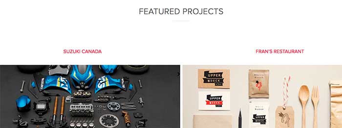
We then created shortcode that allowed us to inject “featured” clients on our home page as well as the regular client work, all sorted by the date the project was completed or a custom weight that could also be specified. Once you create the data yourself, you own it and your not constrained by plugin authors that may simply abandon the project and leave you stranded.
We’re excited to share our new website with you! We hope that some of the challenges we overcame to complete this project may help others out there as well!