Opens in a new tab

Irwin Toy

Irwin Toy has been in the business of distributing and manufacturing toys in Toronto since 1926. We have had the opportunity to create the first ever website for the toy company.
Irwin Toy approached us to create a website to showcase their newest brands and products. We were excited to work with a renowned Canadian brand, and our team had a grown-up playing with Irwin toys. We wanted to design and develop a website with a playful colour palette and typeface. However, as a balance, the website's design needed to be modern and sophisticated with a slick and easy-to-navigate user interface. The client needed to be able to update and make changes to the website in the future. For instance, when Irwin introduces a brand and wants to be able to distribute it globally, their clients will have all of the information about this brand by simply visiting their website

Custom Illustration

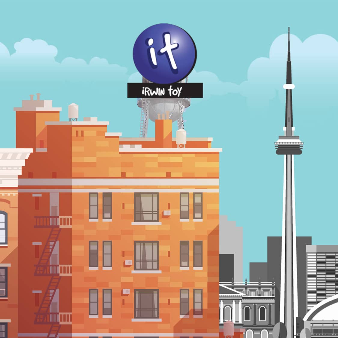
Irwin wanted us to create a custom illustration of their manufacturing building that used to be located in Liberty Village. This building is now the Toy Factory lofts. We created a whimsical scene, with a blue sky and white fluffy clouds and the Toronto skyline in the background. This illustration is featured on the homepage of the website in a prominent way. The intention is to engage the end-user immediately by captivating them and driving them down the page to see the featured showcased products. The client was extremely pleased with the illustration.
Web design in Toronto

Custom Web Design

We design bespoke, responsive user interfaces from scratch in Figma—never relying on off-the-shelf templates or generic themes.

Our team develops scalable design systems, typography hierarchies, and mobile-first layouts tested across modern devices to deliver seamless user experiences for Toronto consumers and B2B buyers.

Toronto responsive web design

Responsive

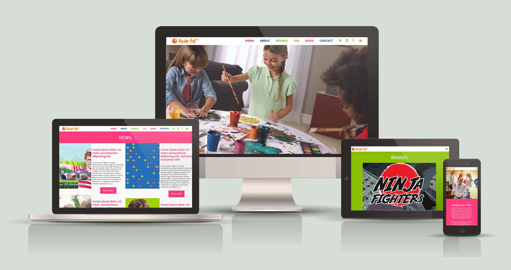
Developing a website that is responsive is no longer a new requirement, its mandatory. We use industry standard tools and best practices to incorporate framework and scaffolding to ensure your website responds on the many different screen widths across many different mobile and tablet devices.

Gone are the days of a “mobile only” website. We will design your site for desktop, mobile, tablet, portrait and landscape viewing. And it will be beautiful!